If your website isn’t converting visitors into leads or customers, it might not be a traffic problem—it might be a button problem.
This shouldn’t surprise anyone. Your call-to-action button is your webpage’s attempt to move the potential client forward. It’s like a salesperson in a car lot. And like that salesperson, your website must be a skilled salesperson or it will lose the potential client.
Your call-to-action (CTA) isn’t just a closer—it’s your website’s most important sales pitch. And too many CTAs get ignored because they’re vague, boring, or worse—demand too much, too soon.
What is Call-to-Action Optimization?
Call-to-action (CTA) Optimization is the process of refining the design, wording, placement, and timing of CTAs on a website or digital platform to increase user engagement and drive desired actions such as clicks, sign-ups, downloads, or purchases. It involves using data, testing (e.g., A/B testing), and best practices to ensure CTAs are compelling, clear, and aligned with the user’s intent and stage in the decision-making journey.
Clear?
Don’t worry, I break call-to-action optimization down step by step below.
The Basics
What is a CTA button?
That’s a common first question. Unfortunately, the common first answer they get is something like, “This is the button you use to direct people to your order page.”
That advice is fine. As far as it goes. But it does nothing to instruct the beginner on call-to-action optimization – how to get their call-to-action buttons to work for them. The problem is that it is focused on what you want – sales.
But your visitor is not interested in your sales. Your visitor is interested in solving their own problems. That might be a toothache, or the need for a new forklift for their warehouse.
Now, keep that in mind as we walk through a few simple tweaks in call-to-action optimization. Tweaks that can dramatically improve your click-through rates—no redesign required.
1. Be Clear, Not Clever
“Let’s Get Started” sounds friendly—but it’s fuzzy. The discipline of call-to-action optimization says, “Get specific.” Tell them what the result of clicking your link will be. Your visitors don’t want to guess—especially in the first five seconds.
To decide what that should be, you need to know what your visitor will be ready for when they arrive at that specific page.
Example: Forklifts ranging from $20,000 to $100,000. Thus, your visitor is not likely to be ready to purchase on their first visit to your homepage.
Instead, they will be looking for a whitepaper (a paper that shows how your forklift solved the problem for another customer in some way).
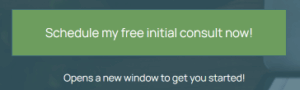
To recap: The discipline of call-to-action optimization tells us that if your button is offering a free consultation, you find a way of telling them the button offers a free consultation.
So, “Download Your Free Whitepaper” is a good start.
Likewise, someone visiting a dentist’s website with tooth pain will want something more specific than “Book now.” Some might be looking for information, so an optimized call-to-action button might read, “Tooth Pain Relief Options.”
To review:
✘ Bad: Learn More
✔ Better: See How We Can Help You Save Time
As you can see, it doesn’t take that much more effort to write a call-to-action button that is specific enough to tell the visitor exactly what to expect. After all, if you are designing the page, you know what you are planning the button to do. Tell your visitors. It’s a good practice and costs you nothing. Besides, it is a good first step to optimizing your call-to-action buttons.
Even more important, it puts your visitors at ease, which buys you credibility. How? Remember, though you know your website is legit, your first-time visitors do not. Telling them what to expect in each step helps to ease their mind. This is just one more step in call-to-action optimization.
2. Lead with a Verb, Land with a Benefit
Step two in call-to-action optimization directly relates to your word choices. Remember, word choices matter in every day life, so you can be certain they do here.
Verbs create momentum. For your visitor to find what they are looking for, they need to act.
Benefits create desire. Assuming that your webpage is optimized according to the user’s search intent [link], the benefit is why the visitor came to your website in the first place.
Pairing the two turns your CTA into a mini sales pitch:
✔ “Get the Plan That Helps You Hit Your Goals”
✔ “Start Your Free Trial and Simplify Your Workflow Today”
✔ “See How We Help Coaches Book More Clients”
Even better? Support your CTA with a short, clear subhead that reinforces the outcome. This subhead is a confidence booster. It gives the visitor one more reason to follow through. The difference? The CTA itself delivers the action and benefit. While the subhead addresses lingering doubt, highlights a key advantage, or adds urgency. Think of it as the persuasive whisper that says, “You’re making the right choice.”
For Example: If your Forklift manufacturing website’s CTA Button says, Download the Whitepaper That Solves Your Lifting Challenges
Your subhead might read: Get expert insights to improve safety, efficiency, and equipment ROI—no sign-up required.
3. Create Urgency Without Hype
Urgency increases conversions, but only when it feels authentic. You don’t need fake countdowns or flashing banners. Indeed, those can hurt your credibility – they’ve been misused that badly. Instead, add time-sensitive language that’s calm but compelling.
✔ “Spots Are Limited”
✔ “Enroll Before [Date]”
✔ “Schedule This Week and Get a Bonus Resource”
4. Match the Benefit to Where They Are in the Journey
I touched on this above. It’s that important to call-to-action optimization.
A visitor on your homepage might need a “see what we do” call-to-action (CTA). However, someone reading your pricing page is closer to making a decision, so provide them with a stronger benefit.
Homepage: “See How We Help Small Teams Stay Organized”
Pricing Page: “Start Your Free 14-Day Trial—No Card Required”
Your CTA should reflect what the reader is ready for—and the benefit they care about most right now.
And to do that effectively, you need a clear grasp of your Unique Selling Proposition. If your value isn’t obvious, even the best-written CTA can fall flat. Learn how to clarify and communicate your USP here.
Want to take this further? Your call-to-action optimization is just one piece of the puzzle—microcopy plays a major role in how users perceive and respond to every interaction on your site. For smart, practical advice on writing clearer, more effective microcopy, check out this UX writing guide from Smashing Magazine. It’s packed with helpful examples and tips even non-writers can apply.
5. Match the CTA to the Page Goal
Every page should have one clear goal. That goal should be supported by everything on the page—and your CTA should reflect it. If your page is educational, your CTA should offer more help. If it’s product-focused, guide them toward action by using a CTA that reminds them of the benefit they will get by taking that action.
Misaligned CTAs confuse users and hurt conversions.
6. Add Reinforcing Copy Near the CTA
Sometimes the benefit can’t fit in the button. That’s okay.
Use the sentence just above or below the button to reinforce what they’ll gain:
“Includes our full 10-page onboarding template, free.” “Only takes 2 minutes to complete.” “No spam. No sales calls. Just practical help.”
This reduces friction and amplifies the appeal of your offer.
7. Test the Value Proposition, Not Just the Wording
Most people test colors or button shapes. That’s fine—but call-to-action optimization (and experience) tells us it’s the message that moves the needle.
Try running A/B tests on the benefit itself:
- “Download the SEO Checklist” vs. “Get 10 SEO Fixes That Can Boost Traffic Today”
- “Book a Free Call” vs. “Find Out What’s Holding Your Site Back—Free Call”
Your best-performing CTA might not be the snappiest one. Rather, it’s the one that speaks directly to your audience’s pain point or goal.
8. Make It Visually Stand Out
Don’t hide your CTA button. Your CTA shouldn’t blend into the background. Use contrasting colors, generous white space, and strategic placement (like after testimonials or near a strong benefit statement) to draw attention at the right time.
9. Test Small Changes That Make a Big Impact
Don’t settle for “good enough.” Test different CTA versions using A/B testing tools. Try changing:
- Button text
- Color
- Placement
- Surrounding copy
- Size
Sometimes changing “Submit” to “Get My Free Quote” is all it takes.
A Final Word on Call-to-Action Optimization: Your CTA is a Conversation
You’re not yelling “Buy Now” into the void—you’re guiding someone who’s curious but cautious. Treat your CTA like the next step in a helpful conversation, not the end of one.
Remember: Every call-to-action sits within a larger experience. If your page doesn’t clearly communicate your value, even the best CTA will fall flat. That’s why after you update your buttons, your next step should be this: 👉 The Website Tune-Up: How to Refresh Your Content for Better Conversions